30 December 2016

September: Chicago Art and Design

September marked a long-awaited trip to the States, a crazy three week stint for me starting with five days in Chicago. J has an aunt living in Chicago, and this year marked 20 years since his first visit to the city, so it was as much a reunion as it was an introduction for me. I was excited to spend some time seeing Chicago's art and design scene, although again, I had lacked time to do much real research. Our days were limited, so a top priority was the Art Institute (of course) and the Architecture cruise through the city.

Unfortunately, we had to be in Chicago while the Design wing in the Art Institute was closed, so all that was on offer was a tiny room by the cafe with a bunch of modernist chairs...beautiful as they are, I mean, yawn. I was hoping for something more invigorating, not least local!! The other design bit was a little 20th c. section with some great assemblages of furniture, but very dated labelling, so I'm sure they're coming round to that part as well... But thankfully, the modern and contemporary art sections were entertaining and beautiful, and for me, a little less self-conscious than the Tate. It had a whole plethora of stuff displayed together, well designed spatially, and colourful! I also think I'm more of a Matisse gal than a Picasso, because I ended up taking lots of pictures of them. However, I would say the cherry on top of the cake was this little piece we found by Karel Appel, to bring us back around to mine and Hannah's trip to Amsterdam! It made me want to look into him again, as I can tell that I'm immediately drawn to his work because I recognised it straight away!


Terribly we ran out of interest for the rest of CAI (tut, tut, tut), and I knew I wanted to at least see some of the public art that Chicago is famous for. I didn't expect to be so impressed by Calder's Flamingo because I'd seen so so many images of it already, but it was for me the most breath-taking, and was a really jubilant contrast to the somewhat sombre, corporate modernist architecture around it. As glittering as they are, I can only cope with it for so long, and when it is juxtaposed with a giant red thing with different shapes and curves, it reminds you to be excited. I was somehow less mesmerised by the Picasso, in part because of the terrible lighting in that corner, but probably because of this lack of fun that I enjoy in his other work and sculptures (namely the loveliest one in NYC that Hannah and I stumbled upon).


As the sun started to set, we ventured back to Millennium Park to catch the final day of the Jazz Festival, in the glorious setting of the park surrounded by shining towers. The pavilion was lit beautifully for the show, showing off its dynamic lotus shape. By the end of the day I was knackered, and looking forward to sleeping, but nonetheless enjoyed the excitement of live music in such a setting!


That's it for now. Hopefully there'll be another blogpost to come about the trip when I finally get my films to the developers... and a sneaky sketchbook in tow too!


August: Sooner, or later, a History of Design Publication

Way back in April, we started working on the concept for a HoD publication, following how exciting it was to get involved in the Reimagining Objects exhibition back in February. We seem to be a pretty enthusiastic bunch, with an exciting set of skills. Lots of us are really interested in challenging the field, and pushing the boundaries of what it means to be a design historian.

In conjunction with the starting point for Reimagining Objects, we wanted our publication to work in the same way with our second essays. What we found once we finished our second essays was a frustration of 'unfinished business', some outright hating the process of providing a historiography, enjoying the topic but never being able to respond the way that they wanted to. This became the purpose of the publication, as a way to express our topics differently.

In a wider committee, we chose our format and method of printing to start our structure for the brief. We knew that we wanted to collaborate with other courses at the RCA; HoD has had a history of being isolated from the arts school, which we feel is a real shame to expanding the opportunity for conversations between us. We immediately chose to have a simple format to make sure that the project would be able to work across the numbers: each essay was given a double-sided A3 page to work with. The one rule was that you couldn't use what was written in the essay. We decided to use the risograph process almost straight away - we knew that there was a printer somewhere in the RCA that we could use, and in hindsight, it was an ideal way to get more involved with the RCA. Each group was given two colours to work with, of which the combination would be decided later. The publication would be organised unbound, and thus could be taken apart and rearranged, reflecting the way that we wanted history to be seen, not as linear, but as parallel and intersecting all the time.

From there, we opened a call to Visual Communication students, of which we had several responses, and then it was all systems go! Everyone was given a month to work on their page, before some intense work with the Royal Duplication Centre, aka Studio Bergini, the risograph guys found on the second floor of the Stevens building in the Illustration lab (on Tuesdays and Fridays!). We put the colours to a vote, which ended up being burgundy and neon pink. After several days in the lab, 2x one hour Uber rides across London with around 4000 sheets of paper, introductions to a finishers in Hackney Wick, a giant chopping machine and a giant folding machine, plus several helpers on hand to collate everything, we ended up with 300 beautiful copies of Sooner, or later, V&A/RCA History of Design's first student-led publication.

Back in June we had our launch, with wine and beer, in which we wanted to discuss the process and what each of our pages meant to convey, and how the collaboration had worked out. We shared the launch with people from various courses, ranging from Architecture to Visual Communication, with a publication to take away at the end. We really enjoyed the whole process, from start to finish, and it became a really exciting way to test ourselves, and what we can do with our previous skills. While in hindsight, we can find a few ways that we would edit the way that it went, it was overall a really fantastic experience that I would love to do again (hint hint! More to come!).

The journey does not end here for Sooner, or later! A full online version of the publication will be available soon once we've relaunched our blog Unmaking Things (also another exciting endeavour!), so will keep you posted!


Rejuvenating the blog.... where have you been Vivien??!

While it is always common for me to start with apologies, I will refrain from doing so this time to save you from having to eye-roll and listen to the 'I've been busy' blah blah. It's still busy, as always, but it's about time that I give myself room to have some 'me' time to write this blog. I think with all the reading and writing, and getting square-eyes looking at a screen, I've been totally exhausted starting out this dissertation journey.

So a humongous catch up is in order, preferably less reviews, and more own work! Because there is a lot of it to share, and it won't be particularly chronological, but if I can catch up in a few posts then at least there is that peace of mind. I will endeavour to post at least once a week, as a way of having something else to think about aside from street food hawkers, Hong Kong and job-seeking (gah!). It can be, once again, my re-newed annual New Year's Resolution.

Each post is going to represent each month that has flown by, starting in August, when the last post was published. Hopefully then we can get back to a speedy recovery! Wish me luck!

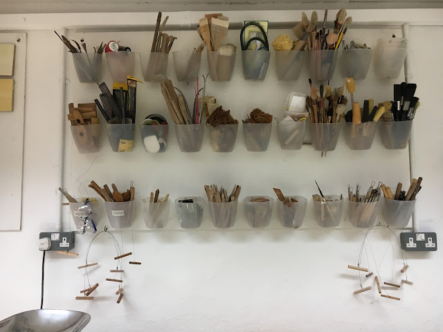
Here is a pic of Julian Stair's ceramic tools, an inspirational metaphor for how organised I wish to be in the coming months.


15 August 2016

Yelena Popova and Michael Beutler at Nottingham Contemporary

It might be summer, but it sure hasn't been a holiday so far (sigh), so actually coming back to the blog as a sure-fire way to release some thoughts, and hopefully, shake off the fear of dissertation work. Who would have thought that a two month break away from readings and writing would be so tough to return to?

Anyway, my sole week off in the last few month or so was spent at home, playing a lot of video games, being fed by my family, cuddling kittens, but also some excursions to visit Katie. One way to redeem myself before heading back to work was to visit the Contemporary's new show; after being so impressed with the previous Simon Starling show, I hoped this one would be just as engaging!

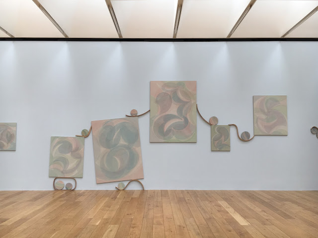
This time, the galleries had been split between two artists, local artist Yelena Popova, and Michael Beutler. Katie and I started off with Yelena Popova in Gallery; In the first room Popova used a combination of mixed media, using sound, video, painting and installation. However, the star piece was in Gallery 2 debuting Popova's piece called After Image. The installation was made up of a series of large paintings, and an assortment of smaller paintings on rectangular, circular and ovular canvases. The concept alluded to the life and death of images, and the expectation of the audience as constant voyeurs of images. The paintings were created from light pigments on heavy, dark canvas, making the pictures seem faded, or as Popova describes them, evaporated. In the light of the room, the paintings 'emerge or withdraw', bringing out a sense of of an almost ghostly energy.

The installation felt very fresh and simple, and quite frankly was absolutely beautiful to explore. I was less inclined to the images, but more interested in the collection as a whole, cleverly strung together with supple pieces of wood holding the paintings in the balance. The one pale blue wall brought a warmth to the pinks and greens in the paintings, and against the three other white walls evoked the feeling of the sea, the pieces as eroded rocks and shells, and weathered pieces of drift wood. It was very easy to get lost in the details of it, and charmed by the clusters of earthy objects. The piece was quiet, comfortable, and as you can see in the many Instagram photographs, ironically easy to make beautiful images from. 


Next door, Michael Beutler was a complete contrast and so an energetic explosion for us. It was the first time I had been to a more interactive exhibition at the Contemporary, and it was a great way to use such a large and bright space. Beutler's work is colourful, inviting and exaggerated, transforming what can be, and often is, a more serious white-cube style gallery, into a playground. The work was made of several makeshift walls, made of a variety of materials; coloured paper, plastic, cardboard, and fabric were all involved. Inspired by traditional Japanese paper walls, the interiors looked as though it was the artists studio, left to rest at the weekend. We again played voyeurs, finding tools, notes, buckets of glue and makeshift machines, used to squash, fold and shape paper into bricks or giant squiggles, or oversized paper waffles dotted around the installation. We enjoyed the aestheticism of the colours, textures, and haphazard placements of so much stuff, bits of paper taped to the walls, string and remnants scattered around that doesn't look far from the mess of my desk at home. The comfort that Beutler gives is one of a childlike daring, where anything is possible. Where Popova's installation is reflective and contemplative, Beutler's is spontaneous and unhindered by the anxiety of age and expectation.


Again I was thoroughly impressed with the show, especially involving a local artist. I enjoyed the pairing of the two practitioners, contrasting in colour, density and interactivity which clearly had been  thought through for the local audience in Nottingham; as the school holidays have begun, what would be more enticing and intriguing than a giant green paper waffle in the window, and the peace and cool temperature of a gallery? From a design history perspective, I enjoyed the way that the exhibitions highlighted each other, and both artists displayed their process as an important aspect of their work. As two very tactile exhibitions, I appreciated that the outcomes were more than just the aesthetic value of their work, which will always look impressive in pictures, but beyond that is about interacting with the work in the space. The exhibition served two kinds of exploration; a truly experiential installation that transfers you into a world of oversized fun and colour, and the layers of meaning we find in creating, looking and documenting images. Looking forward to the next one, Contemporary!

18 July 2016

A Weekend in Amsterdam: Day 3, Helmut Newton at foam

Sorry, again, for the delay in blogposts. End of June was manic, and somehow the whole of July has suddenly booked up with stuff so I just keep forgetting about the blog!

A short one today, seeing as it keeps getting put on the back burner, and Amsterdam was like a whole month ago now (HOW did that happen...)

On recommendation from Barbara, our last exhibition was the Helmut Newton retrospective at foam. Although we love fashion and clothes and photography, we hadn't initially thought of visiting, but we were glad we did; not only did we escape the torrential rain for an hour or so, it was also beautifully curated, and radically different to photography exhibitions I had visited before. The last fashion photography exhibition I had visited was the Horst retrospective at the V&A a few years back, and thinking about the two exhibitions in comparison, representing two different eras of fashion and two different styles, I felt like the way foam displayed the work was totally reflective of the content and the themes they were trying to draw. Whereas Horst was perhaps more chronological in their method of display (obviously reflective of the type of museum the V&A is, and what the audience perhaps expected), it was clear that foam was aiming for a more in-depth, critical approach, treating the exhibition format more like a research process.

Saying that, it did have a bit of chronology, obviously because its a retrospective. But what they did pick out was Newton's commentary of the female body, and I particularly liked the later rooms, when it was clear that Newton had more to say using his photography. I really admired the filmic appeal of his work, the way he captured movement and illusion in his work. I loved the series', where they photography was less about the physical 'fashion' (as in the garments) and more about the model, the muses, the people who were the mannequins. It was clear that he had had that in mind - it was especially clear with his series of dummies, dressed and lit like 'real' women, so that the viewer would double-take on what they had seen. They also showed the documentary 'Helmut by June' (which I keep meaning to watch in full), which revealed his thinking and day-to-day process, and also showed that he wasn't a complete pervert, which one could easily assume from his super sexually-charged images.


It also made me really interested in June Browne, or Alice Springs as her artist name, who was Newton's partner in life and also in work. She was herself an established artist working in fashion photography, and the documentary made me interested in their influences on each other, as the theme from my previous posts about Rietveld and Van der Rohe. The exhibition also featured pieces of Newton's work that revolved around their personal life, such as this portrait below of June, beautifully lit and gorgeously framed. The colours of the walls, changing through the different themes and rooms, brought the photographs to life while also setting the stage of the era that it revolves around. The women, particularly towards the end of the exhibition, and the later work of Newton, feel strong, empowered, and exude a sensual strength that I hadn't seen before. The exhibition framed the women captured as active agents, and I was pretty convinced.


The exhibition ended with the famous 'Big Nudes' printed gloriously 'life size' as a final nod to women, groups of women who were unashamedly naked and strong. It was clear that the models and Newton worked exceptionally hard to create these images, of which some were an attempt to create the exact same image with clothing and without. Imagine trying to do this in film, its just a feat of repetition! 

I was thoroughly impressed with this exhibition, and could have stayed for even longer had it not been lunchtime (we were really, really hungry). If you're in Amsterdam, go check it out, not only is the work on display fantastic, the curation is top-notch with (thank god) really engaging captions and texts. Thanks Barbara for the tip!


29 June 2016

A Weekend in Amsterdam: Day 2, The Shröder House in Utrecht

Our second day actually took us out of Amsterdam to Utrecht. It was the only pre-planned day of activities, as Hannah especially wanted to take us to see the Shröder House (which I didn't know about at all, but I LOVED once I got there). Basically, we can credit Andrew Graham Dixon's 'Art of the Low Countries' for our day trip an hour out of Amsterdam. Thank you BBC 4.

In the Stedelijk Museum the previous day, we saw this little model of the house with another mocked up room by Rietveld in the space, so it gave me a little taste of what I was going to see. It shared a room with Sandberg's posters, which gave me a sense of the dynamic of the Dutch art and design world at the time. It turned out that Rietveld and de Stijl happened to be working on the same aesthetic around the same time, and on discovering each other, Rietveld was embraced as an artist and designer rather than as a local furniture maker.


The house is only open through a guided tour, which we had thankfully booked in advance... otherwise we wouldn't have been able to see inside! The Shröder House was commissioned by Truus Shröder-Shräder, a Dutch socialite who married a lawyer, Fritz Shröder. The lived in a very large, luxurious apartment in Utrecht, but the couple had very different ideas about lifestyle, social status, and from the sounds of it, the material things within that space. Fritz introduced Rietveld to Truus, and let her change one of the rooms in the apartment to the way she wanted it; Rietveld built the infrastructure, of which one element was building in a lower ceiling. While her friends saw the room as very plain she loved the simplicity of it, and thus Truus and Rietveld's partnership began.

In 1924, as a widow in her mid 30s with a teenage son and two pre-teen daughters, she sought a new place to live with her children. She wanted more space, some peace and quiet, and a view of nature. She commissioned Rietveld for the task as architect, but she had a very clear vision of what she wanted. She wanted open space, big windows, and a connection between the inside and outside. They found a piece of land on the outskirts of Utrecht, a plot that they described in an interview as 'a place truck drivers went to piss' at the end of a row of terraced houses. But the benefit of this plot was the land beyond it, which was a lovely field. Neither Truus or Rietveld had had much serious training in architecture, but with Rietveld's knowledge of furniture-making, they sought to create something completely radical.

The front door opens into a square porch with a door to the left and right, a door in front, and set of painted grey square steps to the second floor. The floor of the room is painted blue. There is no longer any objects (except for a few pieces of furniture) in the house, but once accustomed to the primary colours, smaller details become apparent; the different hooks for adults and children's coats; the clear glass post box; the tan leather strap on the back of the bench on the top square step, for leaning on as you use the phone. It was interesting to experience all these textures together. It felt all at once humble and sort of chaotically put together, and yet a lot of fun and ingeniously practical. 

The rest of the downstairs was made up of a simple kitchen, a 'maid's' room which never had a maid in it, Rietveld's studio, and a cosy study room. It very quickly became apparent that Truus and Rietveld were not just partners in work, but also eventually became lovers, in spite of Rietveld's wife and family. The best room on the ground floor was the study room, which had a black painted ceiling for bringing in the space, and lots of inbuilt furniture. It had two fold out tables, painted yellow and grey, and several benches and chairs to sit on, and best of all LOTS of shelving for lots of books. 

The upstairs however, was the real star of the show. Up the grey square steps and a very narrow black spiral staircase, the room opened up to the whole floorplan of the house flooded with the light. Where downstairs was divided, upstairs was completely open, with a view outside from all four sides of the house. the floor was marked out by different colours to signify each room, and could be cleverly enclosed at night or for privacy using several sliding doors, painted black and grey. In a space the the left of the stairs was a room for the two daughters. Their area was painted blue, with two beds in a L shape in the corner. They have their own balcony and bookshelf, and the room was displayed with one of Rietveld's famous tables. Next to their area was the oldest son's room, painted red. His room was larger, to accommodate his baby grand piano which today is replaced with one of Rietveld's Red and Blue chairs, with a large window facing out towards the view. Next to his room was the largest space in the upstairs, a dining and living area which encompassed a whole corner of the house. The most fascinating part was the huge windows that could open completely at the corner, thanks to a very clever 'L' window. One of the gallery assistants opened up the window, and enclosed some of the sliding doors to get a sense of how the space worked, and I could imagine how the house was constantly active and dynamically used. Opposite the room for the girls was the bathroom and Truus' bedroom, which also had it's small details. She had a tiny black drop down table for her alarm clock, and a very thin red shelf next to her bed for her glasses. Built into the cupboards was a sink, and next door in the bathroom was a lovely deep stone bath, a beautiful contrasting material to the glossy consistency of the coloured paint.


Particularly after our trip to the Tugendhat Villa in Brno, it made me think a lot about the role of the architect, but also their agenda. At the Tugendhat Villa, especially with the details that Magdalena shared about the house, you got the sense that the collaboration was very one-sided, towards the desires and influence of Mies Van der Rohe rather than the needs of the family. While the house is absolutely stunning, to me it never felt lived in, luxurious rather than warm and loved. The materials of the house and the furniture themselves felt precious, untouchable and actually kind of discomforting in concept - in some ways it felt a little bit sick. I absolutely loved it and loathed the concept of it at the same time. MVdR, probably tainted by the week, did not come across as a very nice guy at all. Not that that was the point, but it's interesting to find a person beyond the famous name.

The Shröder House on the other hand, in its materiality conveys the complete opposite, even though it is on paper the same kind of object. Both houses are commissioning famous designers/architects from Modernist movements, working at around the same time, commissioned by elite women as a new or second home. Both are situated in already established neighbourhoods, and are local anomalies to be stared at and noticed. Both buildings aimed to be a statement. But somehow, there is something about the Shröder House that makes it completely different to the Tugendhat Villa, which certainly makes the Rietveld seem like a totally different kind of person the Mies.

Ultimately the Shröder House seems to be built, in some ways, for love. It feels like its built with enthusiasm and spontaneity, for the needs of a moment which ended up defining how one used the house. It feels like it grew and changed over time, adding pieces here and there when the idea came, and it sounded like Truus had the ultimate say on how it looked and felt. Pieces like the leather strap on the bench in the porch, feel like a practical lightbulb moment. It was a house that the teenage children was embarrassed by, but then proud of later on in life. In spite of it being an empty showroom, like the Tugendhat Villa is as well, it feels like someone lived there for several decades, which of course Truus lived in until she died in 1985. In that way, the Shröder House is more convincing as a defiant statement of a way of life for a widowed woman and her children, opposite to the decadence of the old Art Nouveau, and the new glamour of Modernism expressed by architects like MVdR.

When a plot of land opposite the house opened for sale, Truus bought the land for Rietveld to pursue his real dream - designing social housing. Today these still exist, but now as a school and studios. Tragically, a viaduct and motorway was built right next to the Shröder House before Truus' death in the 1980s. She remarks in the same interview that she thought at the time it should have been knocked down, that it is no longer the same house without the view. But what I can appreciate in its restoration is the real spectrum of design and architecture that was happening in this period, despite the umbrella term of Modernism, and without the house, I'm not sure you can really tell from individual pieces of furniture in museum collections. While I am no expert, and probably will never be as knowledgeable as some of my friends and tutors are on this period in central European design, I love seeing and experiencing it as an observer of their everyday lives and relationships. While it was all radical, it was real and heartfelt by passionate people.

My last thought, which Hannah and I discussed at breakfast the next day, is how important the role of women are in the process of iconic buildings. Both Lilly Reich and Truus Shröder-Schräder were clearly essential to the identity of both houses, and both women it seems, created for the love of their work and in partnership with people they loved. It's a shame that these women get pushed under the water while names like Mies Van der Rohe and Rietveld overshadow their contribution. I keep trying to find books about Lilly Reich, and come out of libraries empty-handed. It just goes to show that it's still, several decades later, an enormous problem that needs solving by the new generations of design historians by getting past the rhetoric and looking for the details.


26 June 2016

A Weekend in Amsterdam: Day 1, Stedelijk Museum

So somehow, in amongst everything, Hannah and I spontaneously squeezed in a speedy trip to Amsterdam for my birthday. We realised that we could only visit a few things in that time, we weren't about to attempt and Museumsplein escapade. And so we prioritised our two top interests - Design, and Miffy, obviously. We arrived in good time in the morning, so first stop was the Stedelijk Museum. I hadn't really had much time to research beforehand what was going on, but thankfully the Stedelijk's permanent collection was really satisfying regardless of the exhibitions they had going on. On arrival, it seemed like a pretty diverse collection of modern design, the earliest pieces (from what I remember) being from the late 1800s. This suited us pretty well, as it made most of the objects 20th century, a top period for us!

The building seems smaller, but more spacious than the V&A, and I would say the curation is a little more sparse - I guess this suited Hannah and I because it meant we could see all the rooms and exhibitions without much rushing. As well as two galleries organised in the classical chronological order, picking out specific Dutch designs in particular movements in the 20th century, several rooms were dedicated to big Dutch designers, as well as fantastic curation of contemporary art albeit with a clear design edge. While some objects were very familiar to us - Paintings by Mondrian, furniture by Rietveld, etc. etc. - it was a real discovery process for us to figure out the timeline of Western design movements, their overlapping and responses to each other (embarrassingly we had forgotten our dates for de Stijl and Bauhaus, Art Nouveau and Art Deco...it turns out its a fun game to guess what is from which movement), as well as finding some fantastic designers that we hadn't known before.

Mostly the individual rooms were small and self-contained, with a theme within the room and the objects very curiously close and easily-touchable...The Dutch clearly trust their visitors! But it was great to be able to get so close to the work and see all the details that you wouldn't normally be able to access over barriers. We also enjoyed the way they had designed some of their plinths to effortlessly float in the space, not disturbing the link between the paintings and sculpture. We were impressed with what they had chosen to collect - we liked how they had chosen to collect and display parts of the process of making 'art', such as plan drawings of Picasso's Guernica. It was nice to go around and pick out objects that seemed interesting in the context, and to pull out why they were in a design collection.


One of my favourites was Willem Sandberg, who had an almighty role of director and designer for the Stedelijk Museum from 1937 - 1962, but had been involved as a graphic designer for the museum since 1928. Dream jobs much, I imagine that doesn't happen much anymore. A typographer, printer and curator, he designed many of the museum exhibition posters and programmes, before and during his time as director of the museum. He at first resented the museum as a house of 'the past' but changed his feelings after becoming director. What's fascinating is that part of the deal of becoming director was that he would still be able to design the catalogues. He believed that the catalogue was just as important to the exhibition as the exhibition itself, designing 320 catalogues for the museum, even after he became director when he would design in the evenings after the day's work in the museum. Here's a fab article about him on the Eye Magazine website if you want to know more.

It's a shame we hadn't really learned much about him, and after seeing his work and hearing his achievements, I feel a bit embarrassed not to have known about him before... I loved looking at his catalogues, and it makes me even more excited to do a type course at some point. His use of colour and shape is playful and (to me) very illustrative, and graphically eye-catching. I would certainly have subscribed to his catalogues.


Another artists that caught our attention was Karel Appel, a Dutch painter, writer and poet who was a member of the group CoBrA, an avant-garde group of artists. Sandberg commissioned him to paint the walls of the refreshment room, and enjoyed it so much that Appel was brought back to paint a mural on the former restaurant, what is now the opening room of the museum. It's such a happy, vibrant and dynamic image, and when at this scale is just breath-taking. The central oval 'flower' is actually a window, which means the light made that particular area really sparkle. I also loved the way that he played with the space, overlapping and moving from wall to wall to ceiling, making for an energetic bunch of characters.


Our last favourite was actually from a temporary exhibition of Jan Dibbets, a Dutch conceptual photographer. The exhibition was a re-exhibiting of Dibbets Colour Studies from the 1970s, several close up colour photographs of the shiny hoods of cars. The studies had been newly printed to be several metres high, exhibited alongside Dibbets original prints from 1976, (no bigger than an A4 if I remember rightly) which he had printed as large as possible by the technology of the time. From afar, they looked like meticulous paintings, and the photographs were displayed beautifully in these vast galleries with lots of natural light. They looked amazing framed in doorways at this large scale. I really appreciated that these works were displayed in a 'design' museum, because I think it's important that contemporary art is put in the context of design, and how something like scale in the process, made possible through new technologies over time, of making art can make such a dramatic different to the way it captures its audience. In a way, the work was totally new, just because it was that much bigger.


 I was going to try and condense the trip to one single blogpost, but I can tell its going to have to be in a few posts...so bear with me while I write up the next two! Lots of fun things happening this week including (shameless plug) our publication launch! Have a look at this Eventbrite for all the details and maybe you can come down and check out what we've been up to for the last month!

Just as a last note, in light of Brexit, I'm really glad Hannah and I got to visit before the trip would be tainted by the fact that we won't be part of Europe anymore. After taking this course, its even clearer to me that our industry as well as others relies on togetherness, collaboration and consistent criticality of ourselves and each other. It's without doubt that we will miss the diversity that for me, makes Britain what it is. I really think that even though I and so many of my friends voted Remain, we have to continue to believe that we can change things, change people's minds and feelings, otherwise Leave then really will have won. In spite of it, I still feel very much a European, as well as a citizen of the World. I hope that in our industry we can continue to open up, engage and develop the ways we share design with each other.

11 June 2016

Yayoi Kusama at Victoria Miro Gallery


A short little post about this one, as I'm sure you've seen it all on Instagram, but at least you get a cute/rubbish selfie of me and Hanswan.

We somehow managed to squeeze in visiting the highly anticipated Yayoi Kusama exhibition, at the Victoria Miro Gallery in Old Street. As far as I know it's new works (I'm not really a Kusama expert, but I love spots, pumpkins and red wigs), and although there were only a few things there, Hannah and I enjoyed ourselves without having to endure a crazy queue! Top tip, get there for 10am on a Wednesday morning and you get the whole effect without the Disneyland queues.

Of course a highlight was the glowing yellow pumpkin room that everyone is taking selfies in...we got a whole 20 seconds which is well enough time to take an alright selfie, although I'm not great at them. Obviously it's only a teeny tiny box, with a little corridor bit for 3 people maximum, and then lots a great pumpkins surrounded by some very effective mirrors. Fantastic kawaii factor.


What was also lovely was that there was a few outdoor works (although one of them got flooded by the crazy storms we've had recently...) and although it was a bit smelly, I enjoyed the effect of all the floating silver balls in the pond. I loved the texture of the green spotty algae in the water and the reflective silver, and no doubt the effect was to emulate the spots that she uses in her work. I can imagine this as a beaded jacket don't you? Matt green sequins and giant baubles would be great...

Then last but not least, there were some of her paintings upstairs, overlooking the garden and the surrounding flats. They were mostly the textural sort, mirroring the baubles and confetti algae on the pond, but also to finish off, a lovely golden pumpkin painting.

I mean, I'm sure all of this has some kind of conceptual monologue. But with all things considered, I love the fun of it all, and after hearing some of the Japanese artists at a talk late last year for the Kawaii exhibition out in Farnham, I can relate Kusama's work to this timeless, transcendental concept of kawaii. What I admire about it is that it is beautiful, colourful, and wonderfully consumable. It doesn't have to be something with 'meaning' beyond its beauty and pattern, its just wonderful to be around and frankly, makes me very happy. Shame that I couldn't really get anything in the shop, never mind.


Simon Starling at Nottingham Contemporary

It's been a long time, although its the end of the year, I've been doing a lot of things recently so yet again the blog goes on the back burner. At least now that the two blogposts for Design China have now been posted, I feel a little less guilty for not blogging so much. It feels great to write for another platform, hopefully I get to do more in the near future.

But in between all of this stuff, I've visited a few exhibitions so I thought I'd write about those as a breather for all the other bits and bobs I'm doing.

In the midst of it all, I managed to squeeze in two days at home to visit Alex and my parents. Walking up from the train station in Nottingham, I thought I would pop into the Nottingham Contemporary, just because. I was not disappointed! The museum was holding a Simon Starling exhibition, who although I didn't really know much about him before, I left absolutely loving the work on display there.


The first room was dominated with two huge silver blobs, which beautiful in their own right, blew my mind once I'd read label for the piece (I believe a lot in labels). The two tiny photographs ion the back wall puzzled me for a while; the photographs are of Chinese migrant workers outside the Sampson shoe factory in North Adams, Massachusetts in 1875. The big blobs turned out to be representing two silver particles from the cut outs of these two pictures, blown up a million times. The two objects were made of forged stainless steel from Nanjing, before being shipped to Massachusetts to be exhibited at MOCA.  

Immediately I felt like Starling was 'one of us', a design historian in his thinking through objects, images and history. I love that his work is encompassed by lots of different pieces, filling up the space with narrative and a reflection on processes. The contrast between the two tiny photographs and the two enormous sculptures really excited me for the rest of the exhibition. I felt it was crucial that the photographs were a part of this first piece, 'The Nanjing Particles', clearly pinpointing this group of minuscule people in the photograph as a part of history to discover, delve into a recognise. Not only are these objects beautiful, but also socially important, there is a clear message here that is to do with people and their place in history.


The second piece that stood out to me, 'Red, Green, Blue, Loom Music' focuses on the weaving processes that Starling documented at the Antica Fabric Pasamanerie Massia Vittorio in Turin. Behind hanging threads showed a ten minute video documenting the process of weaving from the threads to fabric. In the main room stood what looked like a piano and several object hanging from the walls; it turned out that the piano was actually a pianola, a self-playing piano that uses a reel of punched paper to play. On the walls was a piece of sheet music, called 'La Machinna Tessile' (The Loom), a reel of punched paper for pianola, slatted Jacquard punch cards, and two reams of fabric.

It was exhilarating to connect the dots - During his visit to the factory showroom, Starling found the piece of sheet music on a baby grand piano, 'La Machinna Tessile' by Rinaldo Bellucci, inspired by the machines in the factory. After listening and recording the music, he transferred the music into a reel of punch cards, which produces the pattern on the two reams of woven fabric (from my limited knowledge of weaving, its the front and back!). These punch cards were then transferred into pianola music, bringing the process full cycle, from music, to textiles, back to music again.

This exhibition is an absolute dream for me, and I'm sure if HoD went on a trip to the exhibition we would all be going wild with inspiration for our own work. The whole time I was thinking 'this is so history of design', especially after our first exhibition Reimagining Objects in response to our object essays. As much as I believe our practice as design historians is about research, its also about being able to express that research, through writing as well as through objects, curation, making and collaboration. One thing I would absolutely love to see is Starling's process, his sketchbooks, writings and note throughout his process of making these works. I will definitely be looking out for more exhibitions like this!

If you're around the Midlands, go and see this before it's finished! At the Nottingham Contemporary until the 26th June.