10 January 2018

A long time coming...

Somehow a whole year has gone by, and not a post can be seen on this blog...It has been a crazy year to say the least.

Plenty of things have happened in the space of one year, including graduating from the RCA, getting married, going freelance, getting a job, quitting a job, teaching, writing, publishing, moving out....in amongst having the timely crisis of an arts and humanities graduate with the what-the-hell-am-I-going-to-do moment.

So in lieu of this, let me have a moment to reflect. 2017 has been the happiest I've been in a long time, but also points where I've caught myself burnt out, miserable, questioning etc. etc. In December, I had some time to process the year - work had slowed down, J and I had just moved in together on our own, and I could just sit and think for a bit, mostly about who I am and what I want to be in this world.

This blog starts again as a place for me to spew out things I need to say, to myself more than to anyone else, but if anyone still reads this you can come along for the ride. It might also be somewhere I can come to to return to illustration and making things, something that I yearn for actually as I spend more and more time alone tapping away on a computer. The heaps of paper, and slowly drying out materials is all waiting for me to pick up where I left off, and maybe its a chance to make some more sketchbooks, go on more outings, take some more photos, weave, sew, I don't know. I just don't want to forget that those things make me happy, and one of the reasons why I've ended up where I am now.

Also, especially now as I have become a teacher, I want to make sure that I'm still practicing, learning, archiving, documenting, and reflecting on what I do - otherwise what's the point? None of this is just for the sake of it. None of it is 'work', rather its LIFE. I think often this part of me is mistaken for a goal-oriented, take-everyone-down personality, but it's just who I am. It's just what I've always done. I shouldn't have to keep convincing people about it, and reminding myself that actually, you're okay, nothing is wrong with what you're doing.

And so, little blog of mine, 2018 is for this. Slowing down and doing things for me. I think a return to this is what I need, and keep tabs on what I'm doing and how I'm feeling. I'm excited for the ride.


04 January 2017

September: Chicago and Yellowstone Sketchbook

I decided to take a sketchbook away with me again this year, to try and get back into drawing again. It has been a long time since I've drawn on location, and it's taken me some space and time to enjoy it again. This sketchbook ended up being half empty, but looking at it now several months after the trip, I find it much more peaceful, and pleasing, to look at. As you can tell, I didn't end up drawing very much in Chicago... I think I have gotten sick of drawing the city, skyscrapers and structures, preferring to take photographs instead.

From Chicago, I flew to Salt Lake City to meet my parents, and start a two week drive through Grand Teton, Yellowstone, and Mt Ranier National Park. Somehow in that two weeks, we managed to experience four seasons, heat, heavy rain, snow, the lot. I'm not sure if I really reflected that much, but I enjoyed drawing trees and mountains, and just getting my hand used to moving to depict what I'm seeing again. I brought materials with me, but I ended up also using found materials; at the time, Yellowstone was experiencing one of its annual moving forest fires, and we passed by a spot where the fire had burned through. The experience of walking through the forest was just awe-inspiring, and at that point I had to pick up some charcoal to try and draw what was around me.

In hindsight, I wish I had brought bolder and more colourful materials so that I could make more graphic images. My favourite page ended up being of a dam in Grand Teton, using a paint pen that exploded. It ended up giving an energy that I really enjoy making and seeing in my work, so maybe it means next time I need to use even more wet materials.

From what I remember, I didn't enjoy the experience of facing drawing again, but I think that it was worth breaking that anxiety now rather than later. I want to learn to love drawing again, so I think I will need to carry on challenging myself in this way to overcome it properly. It was freeing to know that it wasn't going to get judged by anyone, it wasn't going to receive a 'Satisfactory'. Let's see what happens this year on my next trip.


30 December 2016

September: Chicago Art and Design

September marked a long-awaited trip to the States, a crazy three week stint for me starting with five days in Chicago. J has an aunt living in Chicago, and this year marked 20 years since his first visit to the city, so it was as much a reunion as it was an introduction for me. I was excited to spend some time seeing Chicago's art and design scene, although again, I had lacked time to do much real research. Our days were limited, so a top priority was the Art Institute (of course) and the Architecture cruise through the city.

Unfortunately, we had to be in Chicago while the Design wing in the Art Institute was closed, so all that was on offer was a tiny room by the cafe with a bunch of modernist chairs...beautiful as they are, I mean, yawn. I was hoping for something more invigorating, not least local!! The other design bit was a little 20th c. section with some great assemblages of furniture, but very dated labelling, so I'm sure they're coming round to that part as well... But thankfully, the modern and contemporary art sections were entertaining and beautiful, and for me, a little less self-conscious than the Tate. It had a whole plethora of stuff displayed together, well designed spatially, and colourful! I also think I'm more of a Matisse gal than a Picasso, because I ended up taking lots of pictures of them. However, I would say the cherry on top of the cake was this little piece we found by Karel Appel, to bring us back around to mine and Hannah's trip to Amsterdam! It made me want to look into him again, as I can tell that I'm immediately drawn to his work because I recognised it straight away!


Terribly we ran out of interest for the rest of CAI (tut, tut, tut), and I knew I wanted to at least see some of the public art that Chicago is famous for. I didn't expect to be so impressed by Calder's Flamingo because I'd seen so so many images of it already, but it was for me the most breath-taking, and was a really jubilant contrast to the somewhat sombre, corporate modernist architecture around it. As glittering as they are, I can only cope with it for so long, and when it is juxtaposed with a giant red thing with different shapes and curves, it reminds you to be excited. I was somehow less mesmerised by the Picasso, in part because of the terrible lighting in that corner, but probably because of this lack of fun that I enjoy in his other work and sculptures (namely the loveliest one in NYC that Hannah and I stumbled upon).


As the sun started to set, we ventured back to Millennium Park to catch the final day of the Jazz Festival, in the glorious setting of the park surrounded by shining towers. The pavilion was lit beautifully for the show, showing off its dynamic lotus shape. By the end of the day I was knackered, and looking forward to sleeping, but nonetheless enjoyed the excitement of live music in such a setting!


That's it for now. Hopefully there'll be another blogpost to come about the trip when I finally get my films to the developers... and a sneaky sketchbook in tow too!


August: Sooner, or later, a History of Design Publication

Way back in April, we started working on the concept for a HoD publication, following how exciting it was to get involved in the Reimagining Objects exhibition back in February. We seem to be a pretty enthusiastic bunch, with an exciting set of skills. Lots of us are really interested in challenging the field, and pushing the boundaries of what it means to be a design historian.

In conjunction with the starting point for Reimagining Objects, we wanted our publication to work in the same way with our second essays. What we found once we finished our second essays was a frustration of 'unfinished business', some outright hating the process of providing a historiography, enjoying the topic but never being able to respond the way that they wanted to. This became the purpose of the publication, as a way to express our topics differently.

In a wider committee, we chose our format and method of printing to start our structure for the brief. We knew that we wanted to collaborate with other courses at the RCA; HoD has had a history of being isolated from the arts school, which we feel is a real shame to expanding the opportunity for conversations between us. We immediately chose to have a simple format to make sure that the project would be able to work across the numbers: each essay was given a double-sided A3 page to work with. The one rule was that you couldn't use what was written in the essay. We decided to use the risograph process almost straight away - we knew that there was a printer somewhere in the RCA that we could use, and in hindsight, it was an ideal way to get more involved with the RCA. Each group was given two colours to work with, of which the combination would be decided later. The publication would be organised unbound, and thus could be taken apart and rearranged, reflecting the way that we wanted history to be seen, not as linear, but as parallel and intersecting all the time.

From there, we opened a call to Visual Communication students, of which we had several responses, and then it was all systems go! Everyone was given a month to work on their page, before some intense work with the Royal Duplication Centre, aka Studio Bergini, the risograph guys found on the second floor of the Stevens building in the Illustration lab (on Tuesdays and Fridays!). We put the colours to a vote, which ended up being burgundy and neon pink. After several days in the lab, 2x one hour Uber rides across London with around 4000 sheets of paper, introductions to a finishers in Hackney Wick, a giant chopping machine and a giant folding machine, plus several helpers on hand to collate everything, we ended up with 300 beautiful copies of Sooner, or later, V&A/RCA History of Design's first student-led publication.

Back in June we had our launch, with wine and beer, in which we wanted to discuss the process and what each of our pages meant to convey, and how the collaboration had worked out. We shared the launch with people from various courses, ranging from Architecture to Visual Communication, with a publication to take away at the end. We really enjoyed the whole process, from start to finish, and it became a really exciting way to test ourselves, and what we can do with our previous skills. While in hindsight, we can find a few ways that we would edit the way that it went, it was overall a really fantastic experience that I would love to do again (hint hint! More to come!).

The journey does not end here for Sooner, or later! A full online version of the publication will be available soon once we've relaunched our blog Unmaking Things (also another exciting endeavour!), so will keep you posted!


Rejuvenating the blog.... where have you been Vivien??!

While it is always common for me to start with apologies, I will refrain from doing so this time to save you from having to eye-roll and listen to the 'I've been busy' blah blah. It's still busy, as always, but it's about time that I give myself room to have some 'me' time to write this blog. I think with all the reading and writing, and getting square-eyes looking at a screen, I've been totally exhausted starting out this dissertation journey.

So a humongous catch up is in order, preferably less reviews, and more own work! Because there is a lot of it to share, and it won't be particularly chronological, but if I can catch up in a few posts then at least there is that peace of mind. I will endeavour to post at least once a week, as a way of having something else to think about aside from street food hawkers, Hong Kong and job-seeking (gah!). It can be, once again, my re-newed annual New Year's Resolution.

Each post is going to represent each month that has flown by, starting in August, when the last post was published. Hopefully then we can get back to a speedy recovery! Wish me luck!

Here is a pic of Julian Stair's ceramic tools, an inspirational metaphor for how organised I wish to be in the coming months.


15 August 2016

Yelena Popova and Michael Beutler at Nottingham Contemporary

It might be summer, but it sure hasn't been a holiday so far (sigh), so actually coming back to the blog as a sure-fire way to release some thoughts, and hopefully, shake off the fear of dissertation work. Who would have thought that a two month break away from readings and writing would be so tough to return to?

Anyway, my sole week off in the last few month or so was spent at home, playing a lot of video games, being fed by my family, cuddling kittens, but also some excursions to visit Katie. One way to redeem myself before heading back to work was to visit the Contemporary's new show; after being so impressed with the previous Simon Starling show, I hoped this one would be just as engaging!

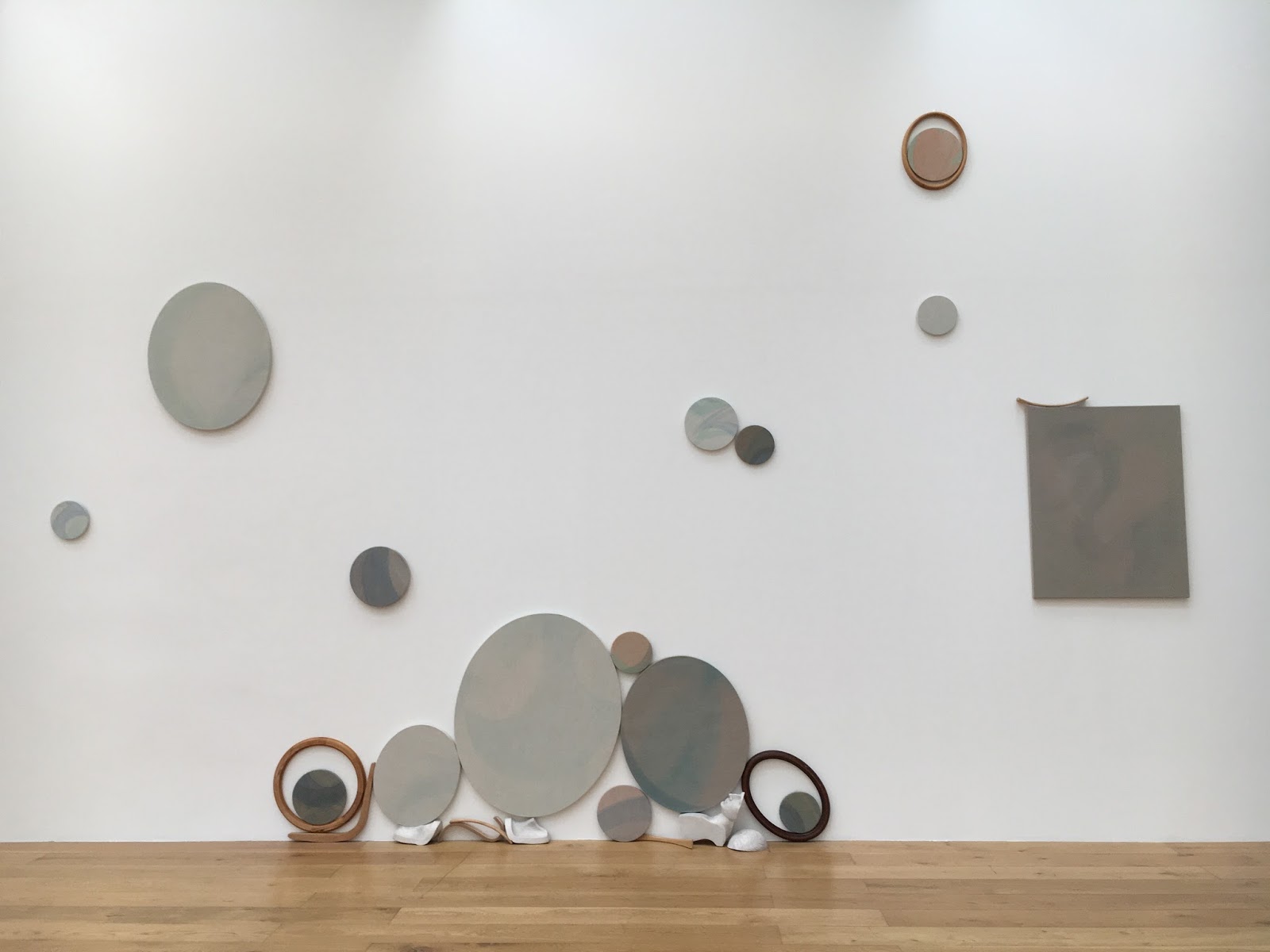
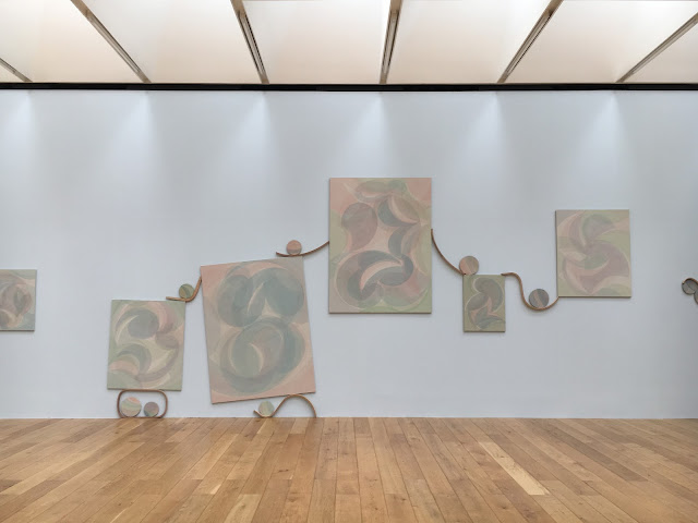
This time, the galleries had been split between two artists, local artist Yelena Popova, and Michael Beutler. Katie and I started off with Yelena Popova in Gallery; In the first room Popova used a combination of mixed media, using sound, video, painting and installation. However, the star piece was in Gallery 2 debuting Popova's piece called After Image. The installation was made up of a series of large paintings, and an assortment of smaller paintings on rectangular, circular and ovular canvases. The concept alluded to the life and death of images, and the expectation of the audience as constant voyeurs of images. The paintings were created from light pigments on heavy, dark canvas, making the pictures seem faded, or as Popova describes them, evaporated. In the light of the room, the paintings 'emerge or withdraw', bringing out a sense of of an almost ghostly energy.

The installation felt very fresh and simple, and quite frankly was absolutely beautiful to explore. I was less inclined to the images, but more interested in the collection as a whole, cleverly strung together with supple pieces of wood holding the paintings in the balance. The one pale blue wall brought a warmth to the pinks and greens in the paintings, and against the three other white walls evoked the feeling of the sea, the pieces as eroded rocks and shells, and weathered pieces of drift wood. It was very easy to get lost in the details of it, and charmed by the clusters of earthy objects. The piece was quiet, comfortable, and as you can see in the many Instagram photographs, ironically easy to make beautiful images from. 


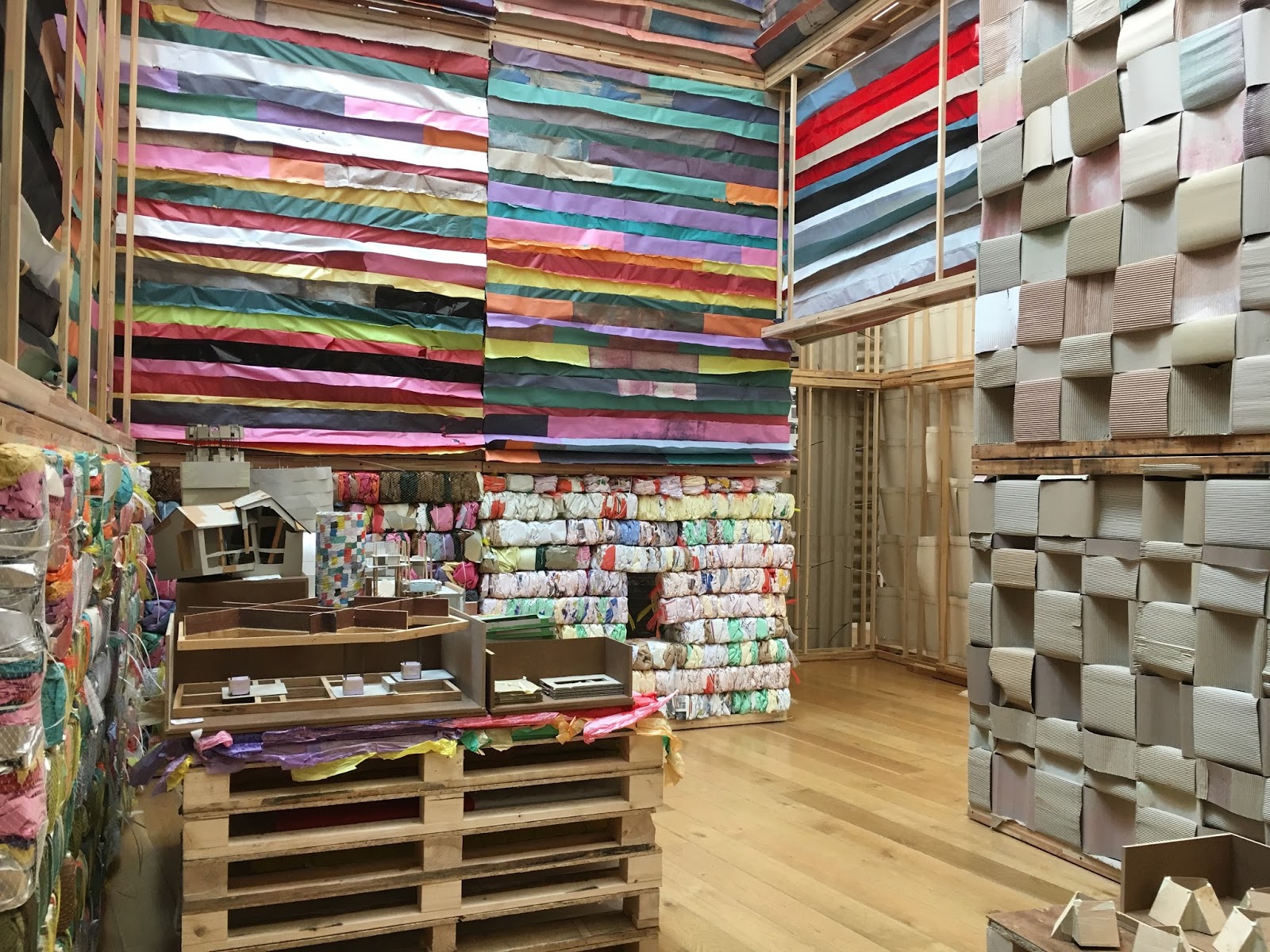
Next door, Michael Beutler was a complete contrast and so an energetic explosion for us. It was the first time I had been to a more interactive exhibition at the Contemporary, and it was a great way to use such a large and bright space. Beutler's work is colourful, inviting and exaggerated, transforming what can be, and often is, a more serious white-cube style gallery, into a playground. The work was made of several makeshift walls, made of a variety of materials; coloured paper, plastic, cardboard, and fabric were all involved. Inspired by traditional Japanese paper walls, the interiors looked as though it was the artists studio, left to rest at the weekend. We again played voyeurs, finding tools, notes, buckets of glue and makeshift machines, used to squash, fold and shape paper into bricks or giant squiggles, or oversized paper waffles dotted around the installation. We enjoyed the aestheticism of the colours, textures, and haphazard placements of so much stuff, bits of paper taped to the walls, string and remnants scattered around that doesn't look far from the mess of my desk at home. The comfort that Beutler gives is one of a childlike daring, where anything is possible. Where Popova's installation is reflective and contemplative, Beutler's is spontaneous and unhindered by the anxiety of age and expectation.


Again I was thoroughly impressed with the show, especially involving a local artist. I enjoyed the pairing of the two practitioners, contrasting in colour, density and interactivity which clearly had been  thought through for the local audience in Nottingham; as the school holidays have begun, what would be more enticing and intriguing than a giant green paper waffle in the window, and the peace and cool temperature of a gallery? From a design history perspective, I enjoyed the way that the exhibitions highlighted each other, and both artists displayed their process as an important aspect of their work. As two very tactile exhibitions, I appreciated that the outcomes were more than just the aesthetic value of their work, which will always look impressive in pictures, but beyond that is about interacting with the work in the space. The exhibition served two kinds of exploration; a truly experiential installation that transfers you into a world of oversized fun and colour, and the layers of meaning we find in creating, looking and documenting images. Looking forward to the next one, Contemporary!

18 July 2016

A Weekend in Amsterdam: Day 3, Helmut Newton at foam

Sorry, again, for the delay in blogposts. End of June was manic, and somehow the whole of July has suddenly booked up with stuff so I just keep forgetting about the blog!

A short one today, seeing as it keeps getting put on the back burner, and Amsterdam was like a whole month ago now (HOW did that happen...)

On recommendation from Barbara, our last exhibition was the Helmut Newton retrospective at foam. Although we love fashion and clothes and photography, we hadn't initially thought of visiting, but we were glad we did; not only did we escape the torrential rain for an hour or so, it was also beautifully curated, and radically different to photography exhibitions I had visited before. The last fashion photography exhibition I had visited was the Horst retrospective at the V&A a few years back, and thinking about the two exhibitions in comparison, representing two different eras of fashion and two different styles, I felt like the way foam displayed the work was totally reflective of the content and the themes they were trying to draw. Whereas Horst was perhaps more chronological in their method of display (obviously reflective of the type of museum the V&A is, and what the audience perhaps expected), it was clear that foam was aiming for a more in-depth, critical approach, treating the exhibition format more like a research process.

Saying that, it did have a bit of chronology, obviously because its a retrospective. But what they did pick out was Newton's commentary of the female body, and I particularly liked the later rooms, when it was clear that Newton had more to say using his photography. I really admired the filmic appeal of his work, the way he captured movement and illusion in his work. I loved the series', where they photography was less about the physical 'fashion' (as in the garments) and more about the model, the muses, the people who were the mannequins. It was clear that he had had that in mind - it was especially clear with his series of dummies, dressed and lit like 'real' women, so that the viewer would double-take on what they had seen. They also showed the documentary 'Helmut by June' (which I keep meaning to watch in full), which revealed his thinking and day-to-day process, and also showed that he wasn't a complete pervert, which one could easily assume from his super sexually-charged images.


It also made me really interested in June Browne, or Alice Springs as her artist name, who was Newton's partner in life and also in work. She was herself an established artist working in fashion photography, and the documentary made me interested in their influences on each other, as the theme from my previous posts about Rietveld and Van der Rohe. The exhibition also featured pieces of Newton's work that revolved around their personal life, such as this portrait below of June, beautifully lit and gorgeously framed. The colours of the walls, changing through the different themes and rooms, brought the photographs to life while also setting the stage of the era that it revolves around. The women, particularly towards the end of the exhibition, and the later work of Newton, feel strong, empowered, and exude a sensual strength that I hadn't seen before. The exhibition framed the women captured as active agents, and I was pretty convinced.


The exhibition ended with the famous 'Big Nudes' printed gloriously 'life size' as a final nod to women, groups of women who were unashamedly naked and strong. It was clear that the models and Newton worked exceptionally hard to create these images, of which some were an attempt to create the exact same image with clothing and without. Imagine trying to do this in film, its just a feat of repetition! 

I was thoroughly impressed with this exhibition, and could have stayed for even longer had it not been lunchtime (we were really, really hungry). If you're in Amsterdam, go check it out, not only is the work on display fantastic, the curation is top-notch with (thank god) really engaging captions and texts. Thanks Barbara for the tip!